ST LUKE’S – Rebrand
St. Luke’s Health System needed a rebrand to position itself as a modern, compassionate, and competitive healthcare provider while honoring its Episcopal roots. The new identity features a bold, colorful cross symbol, a unified icon system, and a clean visual language applied across signage, wearables, print, and advertising. The new brand positions St. Luke’s Health System as a trusted, forward-thinking leader in holistic care.
Branding, Design
Iconography

Signage Concept
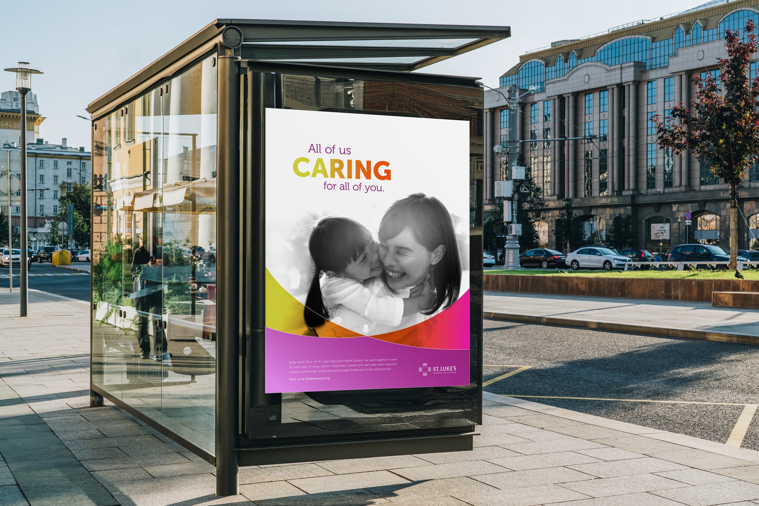
OOO Bus Ad Concept
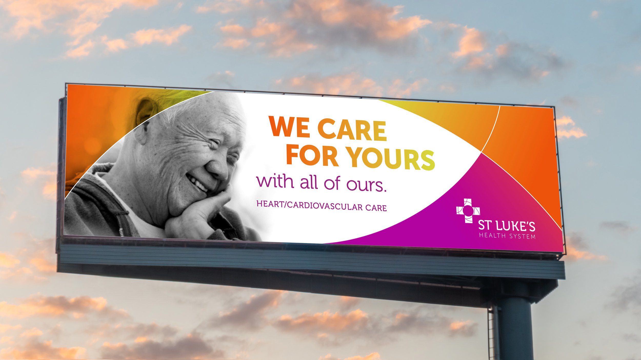
OOO Billboard Ad Concept

Logo Application
Logo Application

Ad Concept

Ad Concept

Collateral Concept